Table of Contents
Best Two-Color Combinations in Interior Design
Today we are discussing about Best Two-Color Combinations in Interior Design.
Color: When light is reflected off an item, the eyes detect color.
- The three primary hues are red, blue, and yellow. Colors that can be blended to make all other colors are known as primary colors.
- The three secondary hues are green, orange, and violet. The hues between the basic colors on the color wheel are known as secondary colors.
- Combining two basic colors yields secondary colors. To make orange, combine equal amounts red and yellow in a mixing bowl. Violet is made by combining equal amounts red and blue. Green is made by combining equal portions of blue and yellow.
1. Basics of Two-Color Combinations:
It’s a good idea to have a basic understanding of colors, terminology, how colors work together, emotional connections to them, and the role they play in creating a reaction before we start choosing color combinations.
2. The Psychological Effects of Color:
We should take a quick look at color psychology because we’ve had an introduction to color theory. This is significant because the colors and tints you select influence how your consumers and clients see your website, business cards, and workplace space. It isn’t about picking colors you enjoy. It’s about picking colors that elicit the feelings you want your clients to believe.
Red: risk, excitement, energy, daring, strength, and wrath
Orange: receptivity, zeal, strength, enjoyment, inspiration, and a sense of balance
Yellow: Sunlight, hope, happiness, brightness, positivism, and freshness
Green: Nature, rejuvenation, kindness, freshness, environment
Blue: Belief, expansiveness, reliability, hope, and imagination
Purple: Royal, wealth, strength, dignity, inventiveness
Warm colors elicit feelings of fun and enthusiasm, as well as passion, whilst cold colors soothe and rest.

3. Two Combinations of Colors:
It’s simple to choose colors that work together since you’ve settled on your ideal psychological. Color pairings that are monochromatic, complimentary, similar, split, triad, can be instantly identified using a color wheel. Depending on the impact you wish to achieve, these distinct color schemes might help you choose between competing and harmonizing colors.
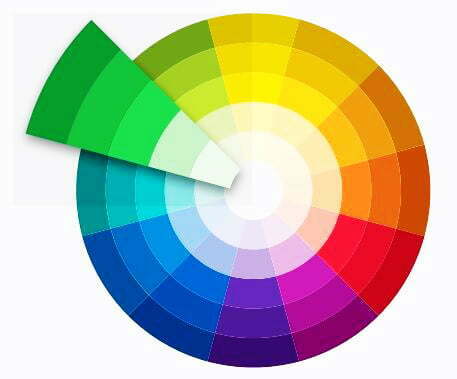
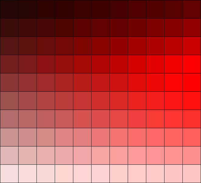
4. Monochromatic Two Color Schemes:
A monochromatic color scheme is made up of distinct shades of the same color. This color scheme is made up of several tints, hues, and tones of the selected hue. Dark blue, somewhat lighter blue, and pale blue, for example. These combinations are excellent for de-cluttering busy designs and achieving a unified, aesthetically attractive appearance. If you really want your brand to be associated with a certain hue, this is a wonderful color scheme method to use. It may also be used to demonstrate development in a project, such as a tiered price list, or to make a design appear more refined by utilizing a richer hue.
5. Combinations that go well together:
On the color wheel, complementary hues are opposite each other. Those colors have a lot of contrast between them, so they’ll help your work pop.
Those opposing palettes may also be seen in nature, and they can give a project a bright but natural vibe. Take orange coral against the blue of the ocean, or lavender against the gentle green of the trees, for example.
Split complimentary color schemes can be seen in the following:
- red, blue-green, and yellow- green.
- Blue, red-orange, and yellow- orange
- Yellow, blue-purple, and red- purple
- Purple, yellow-orange, and yellow – green
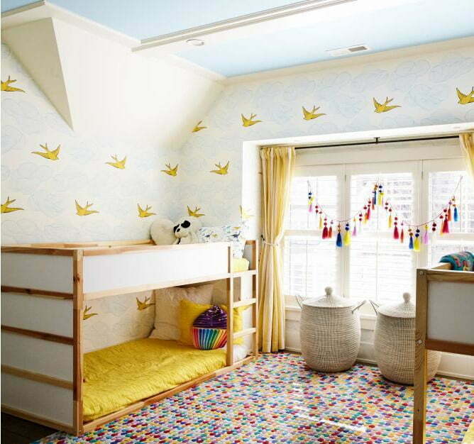
6. Colors to Use in Children’s Rooms:
Playing with color in a child’s room is a great way to have fun. Bright, vivid, and one-of-a-kind colored spaces appeal to children. It expresses their natural vivacity.
However, in a child’s room, being overly daring might be a problem. To create a space where your child can feel alert and alive while still being calm enough just to sleep at night, you’ll want to experiment with a mix of vivid colors and quieter accents.
7. Bedroom two color Palettes:
The greatest bedroom color palettes and range, as well as the environment in which they should be used, are essential factors in interior design, capable of creating an impression that suits your preferred style. So white is seen to have individuality; this is not just a blank canvas waiting to be covered. Best Two-Color Combinations in Interior Design.
Each room in a house has varied color requirements depending on the space’s purpose. Rest and so silence, closeness, and relaxation are the laws of the bedroom, and it could not be otherwise. As a result, the palette and color schemes in the bedroom are considerably different from those in the other rooms of the house, with chosen colors and blends.

1. Ideas of Choosing a Color Palette for a Bedroom:
- It is also crucial to stick to color palettes and trends when picking colors, the first step is to never neglect your personal style: pick a few colors you like and experiment with them to find the perfect colors for your bedroom.
- Returning to color therapy notions, it is evident that, given the aim of the bedroom, we should seek for hues and patterns that promote comfort, relaxation, and so improve the hours spent sleeping. A fundamental purpose in the palette and pattern selection.
- These “guidelines” do not imply that basic, non-rich styles are preferable. Broadly said, we advocate establishing a feeling of balance and harmony to aid in the selection of colors and patterns that match the background.
- Cold hues, such as light blue, blue, purple, and green, are believed to be among the most peaceful and attractive while attempting to relax.
- Colors that are neutral are appropriate for any situation.
2. Ten best Color Schemes to Brighten Up Your Bedroom:
- White and blue
- Brown and Cream
- Off-white and purple
- Mid Yellow and Pale Blue
- Grey Shades
- Monotone green and mild brown.
- Smartly Pink with Neon Green
- White and orange
3. Finest examples of two-color bedroom wall combinations:
- White and light brown
- Light Pink and Red
- Black in White
- Gray Tones
- Rose and Pink
- Off White and Golden
- Light Skin and Orange
- Dark Blue and Light Blue
- Light Orange and Tosca
- Cool Yellow and Black
- Green and Light Brown
- Gray and fresh Yellow